August 28, 2025 / šŸ§€ Create automation rules or buttons with Fibery AI (beta), improved Board View

The last Summer release contains some improvements and fixes. All our QA engineers are enjoying the sun, and it makes releases somewhat chaotic. Our team misses them badly! In September we will speed up, since vacation period will be over (and QA engineers will be back :folded_hands:).

Create automation rules or buttons with Fibery AI (beta)

Now Fibery AI can create automation rules or buttons for your databases. Switch to Build mode in Fibery AI and ask it to create some rule (or button).

This is quite early release, please send us feedback with weird problems and we will try to make it better.

Known issues:

  • Sometimes filters in triggers may be too complex for UI to parse them well, but they may still work fine
  • Sometimes AI uses Script for action extensively
  • External actions are not supported yet, for example, it is not possible to use actions like Send Email or Send to Slack.

Even if you do not get the fully correct rule, it can be a good time saving or educational tool, so try it out!

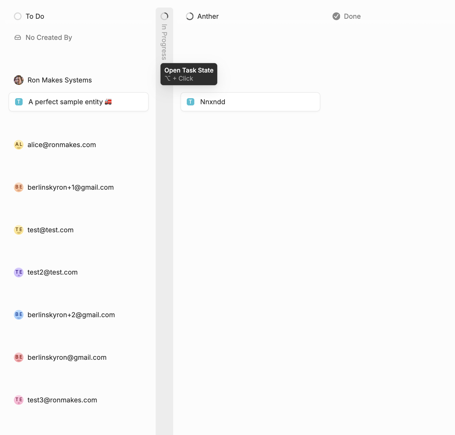
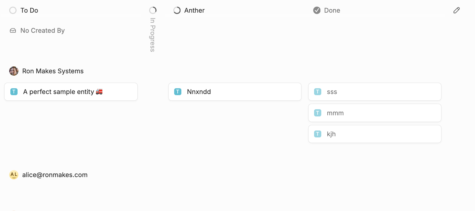
Board View restyling

Board View was improved in several places.

  • Collapsed columns are vertical now
  • New drag and drop mechanic, and now you can drag and drop rows (if there is no sort applied to rows)
  • Updated and refreshed styles here and there

:butterfly: Improvements

  • UI: Updated toggle button component after hearing your feedback: now it is more clear whether it’s active or not, disabled or read-only. Toggle button is used in Quick Filters, Layout options on Entity View, ā€œDisplay asā€ options of a Field Unit, and couple of other places in UI.
  • AI agent: Ask AI to import or sync data from elsewhere (e.g., CSV or Notion)—and it will navigate you to the right place after a few clarifying questions.
  • History data: Activity Log for a single entity now supports very old data, in the past we showed just some recent changes

:shrimp: Fixed Bugs

  • Gantt View: ā€œUntitledā€ labels and incorrect left pane width adjustment when Name field is hidden
  • Table View: Totals row styles overflow
  • Views: For multi-layered menus — keep the selected item on the previous levels in hover state
10 Likes

I’ve been using Fibery AI almost daily to create formulas and spaces. The new feature for building automation rules and buttons is a fantastic addition :fire:

5 Likes

Try to create some rules and let us know how it works!

2 Likes

The vibe of the board view after these updates definitely feels cleaner overall, I think I can tell the good direction it is headed towards.

However, some issues / things I’ve noticed with the board view updates that I miss from before:

  1. There is no longer anything to clearly separate the row groupings (ā€œswimlanesā€) visually in the board. I think it was horizontal lines before (for some reason I can’t even remember with 100% certainty lol)… I didn’t think the way things were separated before were AMAZING necessarily, but without ANYTHING to visually separate row groupings it kinda makes things look hard to separate visually when your board has both column and row groupings….maybe shaded boxes or something could serve this purpose? I’m not a UI wizard, just a thought :sweat_smile:

Current Look → Separation between for cards between these People field row groupings isn’t really immediately definable, need to kinda look for a bit and consciously think about it since the row grouping titles blend in with the cards’ style + there are no lines or shadings visually grouping the swimlanes.

Idea for Updating Look → option to add a very light shading for each row group. Only covers the entities but NOT the row group titles so those are clearly separate…and obviously what I have here is just a shitty version of this via Microsoft Paint, but I just mean the general concept.

  1. I liked how before when you collapsed a column you would have those little colored dots arranged vertically indicating how many entities were in that collapsed column. That was nice, but I don’t see it anymore. My main use case for this was for backlog, I liked having that collapsed most of the time but then I could see if there was anything in my backlog that met the filter, so if my ā€œTo Dosā€ starting clearing up, I know I have backlog items I can bring out without having to remember to expand and check.

  2. For that same database I showed in screenshots above, I have a view that shows entities with no column groupings, the State field as the row grouping, and ā€œLineā€ card size…now, when I try to look at that view, it is bugged out and won’t work:

5 Likes

+1 to separating the swimlanes

2 Likes

Thanks for such detailed feedback! We will definitely consider making further improvements.

  1. Separating rows - I see the problem, and we will definitely think of adding a visual separation between rows/groups
  2. Indication of Entities in collapsed columns - we are going to add a badge counter with number of Entities inside a collapsed column. So this information will be there
  3. Card widths will not be limited when no Column has been defined. We are already working on it

Stay tuned, more improvements to Board view are coming :+1:

7 Likes

Beautiful, thanks!

@mdubakov
I’m not sure if this is intended, but line size no longer extends the lines to be the full width of the board.

We use board view instead of lists because the grouping (rows) behaves in a more desirable way.

Now our line cards cut off half way through the board.

2 Likes

Save behaviour for us.

having the same issue here

Card widths will not be limited when no Column has been defined. We are already working on it :folded_hands:

2 Likes

The vertical collapsed columns looks awesome! :slightly_smiling_face:

3 Likes

Thank you for the update!
Looking forward to playing with AI CSVs.

Thank you!


Awesome! I’m with @ESGdataBoi on this one.


Also, since you’re on the topic of styling, while I very much like Fibery’s general design approach, I find clear definition between hierarchical elements generally poor from a UI perspective. The side bar clearly suffers from this. And I might use this opportunity to raise again the following two issues:

  1. Vertical spacing between individual cards. I thought this was improved a bit, but seemingly not.
    ISO-65415618156 standard for KANBAN board spacing
    Colour bleed on the board between cards remains a persistent and practical one for me. It reads like a column, no?

  2. I would love to see an intelligent / rule-based frame around cards - thickness, colour and line-type (dash, dot etc) This visual cue could be very useful, especially on whiteboard.

Thank you!

2 Likes

This is great feedback, I agree the swim lanes are much better with some graphic indication of them across the screen.

Would be curious to get your feedback on some other swimlane tweaks we’ve talked about in the past, such as here:

I also think it would be useful to have the ability to have column headers if you wanted to do a board set up with just rows and no columns as a way to group entities for an alternative view, great execution in TargetProcess I talked about before, too:

Here’s that post:

Thanks!

1 Like

Love these improvements. Just some things I would like to see improved too:

  • Card name bolded. Currently it looks like this:

    There is almost no visual distinction between a card name and other texts, so it makes it difficult to focus on what you are looking for. Column headers are same font styling as card names.

  • Being able to increasing the width of each column. And basically just having 3 types of card sizes:

    • Minimal (renamed from ā€œlineā€)
    • Normal (merge ā€œsmallā€ and ā€œmediumā€ together, since they are the same but just different width)
    • Full (includes field names)
    • For all 3 types you should still be able to change width of columns
  • Swimlanes, as mentioned by others above.

5 Likes

Did you mean ā€˜column’, or ā€˜card’ ?

The vertical gap between cards is increased in latest update.

I would love to see an intelligent / rule-based frame around cards

This is not yet planned, but we will consider it. Thank you for you feedback!

This is awesome.

I’ve used no code automation tools quite a lot and I find the Fibery UI very difficult so the AI to at least get it started is a big help

Yes and also when it does iterations to fix script errors, it creates new rules/buttons rather than updating the existing ones.

One other thing for the AI chat is super helpful is the ability to upload screenshots. I use it all the time directly in AI chat tools because it retains context and I don’t have to extensively type out instructions

1 Like

Nice! Looks very clean. In addition to the comments already made, I also think the fields that are related to the columns are now too low. They are related to the column header, not the card below, yet are closer to the card than the header.

Also noticed there’s a bit of an assumed hierarchy now in the design Rows live inside of columns. This can be seen in the way things are collapsed. Collapsing a column makes it go all the way down all rows,

but collapsing a row only keeps it collapsed in it’s name (first cell):

Would be nice if the rows also took up the whole columns when collapsed, as that is technically what really happens, but in the UI it feels a bit like its just collapsing the first cell, on contrast with the columns collapsing.

Also note that the board view in Relation Views looks a bit off (the white background):

Tried this to build some common cases I have made in the past. I’ve noticed it doesn’t really know what it can do. For example:

ā€œUnfortunately, Fibery currently does not support copying rich text document fields (like ā€œTemplate Contentā€) from a related entity (Template Doc) into another document field (Doc Content) using formulas or rule-based automations. This is a known limitation of the formula engine for document fields.ā€

This is wrong and outdated info. Technically it works with the scripting, but it’s less robust than the no-code automation as if field names change, the scripts break.

Another example:
ā€œFibery’s no-code automation currently cannot fully automate ā€œcreate all Tasks from all Template Tasksā€ for a Project Template—whether triggered by linking or field update—because:ā€

This is actually possible using lookups and ā€œWhen entity is linkedā€ trigger.

:heart_hands:

This is quite small, but honestly one of the best things this week haha. I’ve had a few times where I thought I was integrating, but was actually syncing or vice versa. Makes it much more clear where you are in menus. Thank you!!

3 Likes