Thanks! This is definitely a bug, we’ll take care of it
2 Likes
This also looks like a bug, we will handle it. Thanks for such attention to details!
P.S. Board View improvements are still ongoing, and we are continuing to polish it (with your help  )
)
2 Likes

3 Likes
This will be included in next release 
6 Likes
Card yes, corrected now
Thank you @Zauri
Though the difference seems quite insignificant. To me the cards should be able to be clearly their own entity.
Would you at least consider:
1. Making the frames one shade darker or one pixel wider?
2. Give us back control over background colour?
I looked back at the interface of Fibery of 2019. Compared to 2025, it’s de-evolution in terms of simple definition of elements - see images. The difference is staggering (if we could vote, I’d choose the better definition layout any day). Clarity = functionality. Functionality = efficiency. Therefore Clarity = efficiency.


I think I have mentioned this before, but again, as a designer I get, and very much appreciate, the subtle aesthetic approach. The likes of monday.com and smartsuite.com are an eye strain to me frankly compared to Fibery. But Firmitas, Utilitas, Venustas is also a hierarchy.
Kindly consider the visibility / definition case please.
6 Likes
That difference from 2019 to 2025 is striking. Totally agree that 2019 is miles/kilometers ahead for visual clarity.
2 Likes
The board comparison is unfair, you can have the same view (or better) in 2025 board view.
But the sidebar… wow SO much better. Would love to have the old sidebar design 
2 Likes
To be fair, the functionality of the product has changed a great deal since 2019, and the old sidebar would not have allowed users to do all the things that are now possible.
Also, I feel like the comparison is a bit disingenuous: comparing apples and oranges.
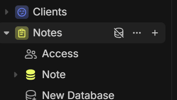
I mocked up a sidebar to get pretty close to the one from 2019, and I don’t feel like things are vastly different:
vs

If that’s the style you like, go for it!
For what it’s worth, the expand/collapse icons were specifically introduced following feedback from users, so 
3 Likes
I agree that comparing the current sidebar to the previous version isn’t entirely fair. The sidebar is now much more powerful and versatile than before (and beautiful), with capabilities that exceed tools like Notion and ClickUp. While there’s always room for improvement, I appreciate the significant progress made.
Sidebar theming
The dark sidebar with light theme option is a welcome feature, though I think this combination could benefit from refinement for better visual cohesion. The ultra-black sidebar against the white content background feels too abrupt - a softer transition would create a more polished look.
Kanban view enhancements
The kanban view also has potential for improvement. Adding more contrast between cards and the background would significantly improve readability. Additionally, the ability to color-code columns (similar to Notion’s approach) would be a valuable addition for better visual organization.
2 Likes
You can already achieve that via Settings → Preferences → Dark Sidebar
I would agree with @ChrisG above, as the current sidebar design is far more functional, crisper, and has better contrast (at least in dark-mode, as shown above).
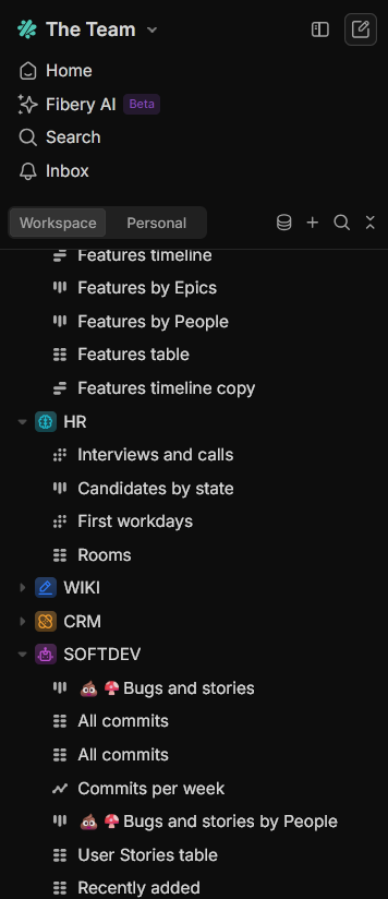
However, some users in this thread are responding positively to something in the old design, which made me look a bit closer.. and perhaps it’s that first level of hierarchy to the left, for the top-level Spaces. Compared to today, they feature larger icons with a bit more color impact. They do give you something a bit more steady to instantly land your eyes on for scanning through the main nav and finding your different modules and views.
It’s easier to tell what is a top-level item quickly using the old design: Spaces have different font treatment, sizing, and a far larger icon / color block. The icon for a space is clearly larger than the icons / emojis in the views / tables below it.

Compare to current hierarchy, where a space and it’s ‘children’ have nearly identical font treatment, and a space’s icon is in fact smaller (?) than the children.
The star icon/emoji in “Favorites” vs it’s child item in “3Ds Checklist” below illustrates this well.

I wonder if a subtle tweak to the overall sizing of the Spaces icons / color box behind would help with this visual hierarchy
6 Likes
It’s exactly that, I thought it’s obvious. The difference is being downplayed in my opinion - The distinctions between the spaces, the levels… it’s much clearer.
I think that’s exactly it. I often struggle visually to find ‘groups’ of
things in the current sidebar (which overall I like).
Being able to instantly visually recognize & traverse the hierarchy
without focusing so hard could be a tiny change with a huge improvement
2 Likes
Interesting updates, great work again!
The feedback on the sidebar is great, but there is a dimension that needs to be considered which wasn’t relevant in 2019: it is now possible to have Folders in the sidebar, and Folders can contain spaces, but can also live within a Space, and within other Folders.
This makes it challenging to use icon sizes to give an indication of where an item sits in the hierarchy.
Should the icon for a Space be smaller than the icon for the Folder that it lives in? What about Folders in that Space, or Folders within Folders within a Space?!
And Views in Folders/Spaces?
For a simple one-level hierarchy (which was the only possibility in 2019) the size questions are not so complex.
Suffice to say, the current design choices have not been reached thoughtlessly.
But as I said, feedback is always welcome. Onwards and ever upwards 
4 Likes
Can you elaborate on how you can have the same view in 2025 board view? The things that jumped out to me in old view was the horizontal line under column titles, bigger text for board title, and background color to make the individual cards pop more.
One more thing as I’m using the board view more:
Drag and drop…
It was changed to the newer mechanism. I like the consistency (slowly moving things to this new mechanism). But I also can’t help but feel its a step backwards in terms of UI manipulation. The new one TECHNICALLY has more control (especially for hierarchy, its more clear where things are gonna go), but there’s something really intuitive about a drag and drop where you are picking up the card and moving it, and everything else moves around it.
Old:
New:
Maybe bringing the old feeling into the the new mechanism.
Also one more thing: when dragging around things with sort, it shows that when I drop it will go to one place, but actually goes somewhere else:
While this does make sense (because there’s a sort on). With this new drag and drop I lose the card I just dropped, it feels off. I think showing where the card will actually go when dropping is important. Right now the blue line is lying to me!
5 Likes
Just brainstorming:
- Highest level = largest icon
- Slight alternating shading / “banded rows” (top level and within)
- Increase indent only for top-> second level, or marginally based on hierarchy (distance between top → 2nd > distance 2nd → 3rd > …)
- Increase distance between top levels
- Larger font size for top level
2 Likes
I think you mentioned exactly what should make the sidebar visually better.
I’m a Fibery user since 2024 so I didn’t see the old drag and drop behaviour but I agree with you, by visualising your video, the drag and drop was more obvious and visually easier before.
On my opinion, @Eren_Turgut mentioned the right point. Perhaps it’s about levels and not if it’s a Space inside a Folder or a view that’s in a Folder which is inside a Space. This will allow the user to choose if he wants a folder as a first level or a Space as a first level, etc… But perhaps it have it’s limitations. If you have 10 levels, it will be complicated.