Agreed – given the complexity and potential flexibility of the sidebar, a one-size-fits-all approach is always going to be fraught with challenges. Chris and the design team know this far better than even the most frequent, power users of the platform.
Personally, the fairly recent changes to the Workspace / Favorites (Personal) section eliminate nearly all of my complaints, as it drastically reduces the amount of “stuff” I need to look through to find my desired items. But I could still see the point that more complex navs than our workspace start getting tough to visually parse, and some amount of hierarchy is lost.
How to address it without completely breaking things, sheesh… I wouldn’t envy that task and I’d imagine there are far more revenue-focused areas the team would tackle first.
I may still move forward with our internal browser plugin for our team (just a css overlay), that simply increases the top-level items icon size a bit. This small changes helps us parse the side nav hierarchy a bit better.
This is missing the point. It’s not about style. Interface design - particularly for a functional tool - is about hierarchical clarity first. It should clear as well as easy on the eye. That is graphic design.
My wish-list for for the side bar:
Reverting to the 2019 alignment
Making icons of SPACES larger or more pronounced, like 2019
Making SPACES TITLES bold (or to have the option to do that)
Indenting / outdenting folders to differentiate them from view / databases.
In terms of the main window, I would love to have the option to change the background colour.
The 2019 sidebar did not support folders.
If you want the spaces left-aligned as they were in 2019, how would you square that in the case where a space lives inside a folder? No indent?
Should the icon for folders be bigger or smaller than space icons, in your opinion?
Is the answer different for a folder which contains one or more spaces vs a folder that lives within a space?
We will keep collecting feedback, but it’s fair to say that the sidebar is not likely to get a significant revamp any time soon - the sidebar was given extra functionality (and was redesigned as a result) about 6 months ago - and we are not currently focussed on this area.
Ya, I can see this different ways. In my humble opinion, whatever the highest level (farthest left) is, it would help visually for this to stand out more, such as being larger than the sub-items. So regardless if it’s a space or a folder.
Don’t know, I’m not a UI designer. Though there are surely many solutions to this. Here are a few that come to mind:
Keep the alignment hierarchy, but have a shaded background (or boundary) to all the folder content.
Collapse all other entities in the sidebar and grey them out when a folder is expanded.
Or why not just make all the text of entities within the folder (wait for it) bold when it’s selected.
Or what about making all spaces bold (there’s that word again) and “unbold” them when the folder (the title of which remains bold) is selected.
If you do nothing, would you please consider giving us the option to have space titles in BOLD, or make the icons bigger? (We shan’t tell the old Mac team. Promise) Or come to think of it, why not just make space titles a DARKER GREY (or black?).
All this is raising a related issue. Why would you remove bold from CARD titles? I get that it may not be desirable to have these titles bold everywhere, but surely that can addressed in another way.
On these recent Fibery screenshots everything reads so much better to me. The current iteration of Fibery is simply, less clear on all these views.
My eyesight is fairly good, but know of at least one colleague who I know will struggle using Fibery because of this issue of lack of graphic definition.
Thank you, I know the Fibery team cares about, and listens to users. I can imagine that user-requirement-management must not be easy. And I don’t think you guys make decisions lightly at all - part of the reason why I am here. I rest my case. Your ball, your garden.
I think I can see where they are going with the new UI decisions. It’s not quite there yet, but I get the feeling that the end result will be overall better after some kinks are worked out and final touches applied.
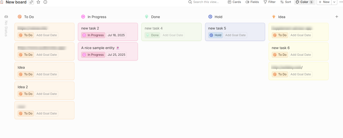
For those wanting more contrast in board view - I started adding more color and love the way it looks. Adding some custom colored icons also can add a bit of visual pop.