CHANGELOG: September 2, 2022 / Buttons on all Views, Gitlab Actions

:point_up_2: Buttons as units on all Views

button-as-unit-on-board-view

Previously, Buttons have been available on Table View only. Not anymore: pick them as units on Boards, Timelines, Calendars, and Hierarchical Lists.

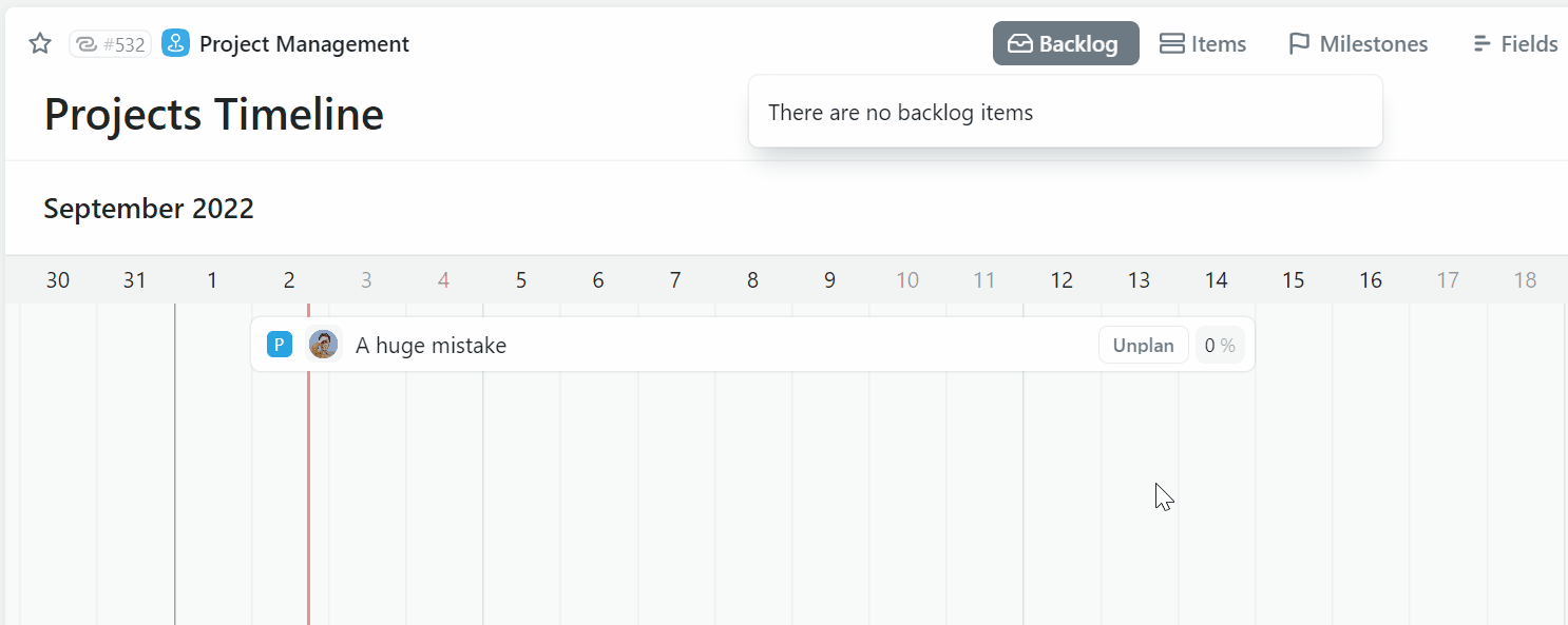
Among other things, useful for an advanced workflow (above) or a smoother planning experience (below):

button-as-unit-on-timeline-view

:robot: GitLab actions

When something happens in Fibery (ex. a Story is completed), update GitLab.

Here is a list of possible actions:

  • Merge Requests: create, merge, approve, close
  • Branch: create
  • Issue: create
  • Incident: create

If an action is missing, please let us know.

:spiral_calendar: New date range picker (experimental)

date-range-picker

Adjusting an existing date range in our old date picker has been a challenge so we replaced it with a new one. Have you seen anything like our “is this a new start or a new end date?” solution? :fox_face:

Also, the new date picker supports casual text like next Tuesday. Check it out via the experimental features and let us know what you think.

:butterfly: Improvements

  • Rules and Buttons load faster now.
  • Relation Views for to-many relations have gotten more polished albeit still experimental — we are eager to hear your feedback.

:shrimp: 9 Fixed Bugs

  • Reordering columns hides button in the table
  • Folders inside Smart Folders can’t have Views anymore
  • Smart folder: dragged or created context views get moved to the folder only after page refresh
  • The same GitLab account is used in integrations and in automations
  • Long buttons names should be cut on Entity View
  • Edit button pop-up unexpectedly disappears after changing to Disabled
  • Unable to sort headers on Table View for second Button column
  • Hide or disable buttons for Viewers
  • Units selector doesn’t show broken button unit if there is more than one such unit
9 Likes

New date picker, what an unexpected treat!

This is a really great feature :slight_smile: If we can access this “text date interpretation” in formulas, automations and scripts, that would be amazing!

My first observation is that date & time fields don’t have a time picker anymore. You get a reading of the time interval at the bottom which is great but no time controls.

1 Like

My first observation is that date & time fields don’t have a time picker anymore.

You will see a time selector if you click a time into a text input

2 Likes

Woohoo, natural language parsing is coming to Fibery! Excellent.

1 Like

I think the new date range picker could do with some rough edges sanding off.

The different left/right highlights on an individual day as you hover over them are honestly pretty terrible UX: It makes the user think that the UI will do different things depending on which half of the day you click on. This isn’t actually the case (or at least, it isn’t until you have an existing selection!), so it is just super-confusing.

When the picker is blank, hovering over a day highlights half of it. Clicking then highlights the whole day, which makes me think it’s finished selecting the range already. When you move your mouse you realise this isn’t the case and that you’re now selecting a range as you might expect. But up to that point it’s all just unnecessarily weird.

Once you’re in the middle of selecting a range, if you happened to click on the right hand half of the start day, it still leaves the gradient floating there in the right hand side of the now wholly-selected start day, which looks odd if you then hover over an end day that is after the start day. Fairly minor, but poor UI polish.

Once you’ve then selected the range, if you change your mind the behaviour is rather counter-intuitive there, too. It now does matter which half of the day you click on, as that determines whether it moves the start or the end date. The click targets are half as wide as you normally are used to on date pickers, which isn’t ideal, especially on mobile, where this is almost completely unusable.

I can’t drag the start or end markers, which I certainly expect to be able to do on mobile, but probably also on desktop. If you do try to drag-select a new range from inside the existing one then you get some UI artefacts that persist even after releasing the mouse button:

To make matters worse, if you want to pick a different date range entirely, you now can’t without clicking the little “x” icon and starting all over again, because clicking anywhere outside the existing selected date range just extends it rather than starting all over again. The system now doesn’t let you click on the first half of a day after the current range to indicate you want a new range, even though that might actually justify the split-day UI in the first place.

I urge you to reconsider the behaviour on this one; personally I would avoid reinventing the wheel here and use a decent open source component instead.

You might like to take some inspiration from:

Thank you for the feedback! The point about the mobile version seems reasonable to me, I will need to figure out something, even though mobile support never had been a priority.

Initially, I kept in mind the case when you need to edit an already selected date range, e.g. extend it to several days or weeks, I guess it often happens in the work management sphere.

You may notice, that the problem is not solved at all in the examples you provided, you need to keep in mind your start date, choose it again, and later choose a new end date.

So, inventing the wheel was required here, and that led me to follow up decisions, like day halves, gradients, etc. It may look not intuitive like any innovation, but it works (on desktop at least :-)).

Yep, I get what you’re trying to achieve here and the intended functionality is laudable, but the behaviour is surprising compared to other implementations that people are used to.

You could achieve the same thing by making the start/end markers draggable, I guess. Although that won’t work so well across month boundaries without some very clever coding to automatically switch months as you drag outside the existing month - not sure how that would work intuitively.

I actually find that I’m more likely to want to choose a range that does not overlap with the existing one if I have made a mistake. (E.g. I chose the wrong week, or month, to start with. Or I want to move my two day task from Monday/Tues to Thurs/Fri.) That use case is currently very clunky indeed.

1 Like

Oh, and one other final observation - in all other date pickers, once you have selected the date (or date range) the pop-up then disappears. In this instance, you have to manually click away from it after you’ve selected the date, which is a bit weird and unintuitive.

IMO you should not ignore my feedback here. I’m not just an end user, I have also myself done a lot of UX work, including building things like a complex react filtering component that needed about 80 unit tests to prove its transitions and keyboard accessibility all worked properly. Good UI/UX is hard and I appreciate how much time and effort goes into building complex UI components like this. It probably feels like I’ve ripped into your work and you feel a little deflated by that, for which I apologise. I am not trying to “be right” here, I am trying to give you constructive feedback so that Fibery can ultimately do the right thing.

I find your comment “It may look not intuitive like any innovation, but it works” very strange. If you can’t add the functionality without it being unintuitive and frustrating to use, what’s the point? It is possible to have good functionality that is also intuitive. In this case, I think you’d be better off making the ends of the ranges draggable, if you really want to support adjusting the range.

Personally, I don’t think the trade-off of having to click away to confirm your selection is worth the overhead. People normally select what they want correctly first time, and if they don’t, they can always re-do it. You’re optimising for the 5% use case, not the 95% one.

(Also, as an end-user of Fibery I would far prefer you grabbed an acceptable off-the-shelf open source library to solve this problem and instead spent your time on other more pressing issues, such as the chips in list items being impossible to edit when the menu / maximise buttons appear over the top of them (yes, I know that will be fixed soon, but it’s way more important than making a custom date picker!), or making small-width items on the timeline view have visible/legible text.)

We can’t just close the popup after selection, because users can want to adjust the time in case of date-time / date-time-range. I’m not sure that it’s okay to introduce different behavior for the same date picker, depending on the time available or not (from both UX and developing perspectives).

Quick feedback on this old feature. I love the casual text feature, it is awesome. I use this for forecasting potential projects and it works nicely, but requires training with new users for the below reason. The casual text only works with the start or end but not both.

  • :heavy_check_mark:If I select a start date, then highlight ‘No End Date’ and write ‘for 9 months’ / ‘+ 9 months’ / ‘in 9 months’, it works perfect.
  • :heavy_multiplication_x:But it would be great if I could write the whole thing in one go. ‘6/1/23 + 9 months’ or ‘9 months starting in June’ or ‘today for 2 weeks’, etc.
1 Like