After the excellent work with the timeline, I think it’s time to improve the calendar view. At least we should be able to select different “card” sizes. In our case, we use the calendar to view the updates that we have planned for maps (we work in video games) that have already been published.
With formulas, we recur the task once it is completed, but if the map’s name is too long or if we have two maps in a recurrence, the name is cut when, in reality, there is plenty of space in the day.
Yes we would also love to use the Calendar view. I can think of multiple improvements, but I would be already so happy if only readability of the cards is improved
Hey everyone, sharing here with the community a few ideas on top of what was already shared. I think these potential improvements to the Calendar view.
Critical Pain Point
The current implementation’s biggest issue is information visibility and readability. It’s extremely difficult to get a clear view of event details and their context at a glance. This fundamentally impacts the calendar’s usefulness as a planning and visualization tool.
Current Challenges
Important information is truncated or hidden
Property layout makes it hard to scan and comprehend event details
Overall visualization feels cluttered yet paradoxically lacks important information
The Calendar view’s current state significantly limits its practical usability
Proposed Improvements
Core UI Enhancements
Information Display
Restructure property display: Show properties vertically instead of inline
Allow configuration of which properties appear inline (e.g., Assignee and Status)
Improve information density while maintaining readability
Tooltip Optimization
Remove duplicate tooltips (currently showing both system and Fibery tooltips on hover)
Visual Customization
Text Display
Add text wrapping option for entity titles
Configurable entity icon visibility
Calendar Grid
Option to show/hide weekends
Week number toggle
More subtle grid lines
Optional weekend highlighting with different background
Reference Examples
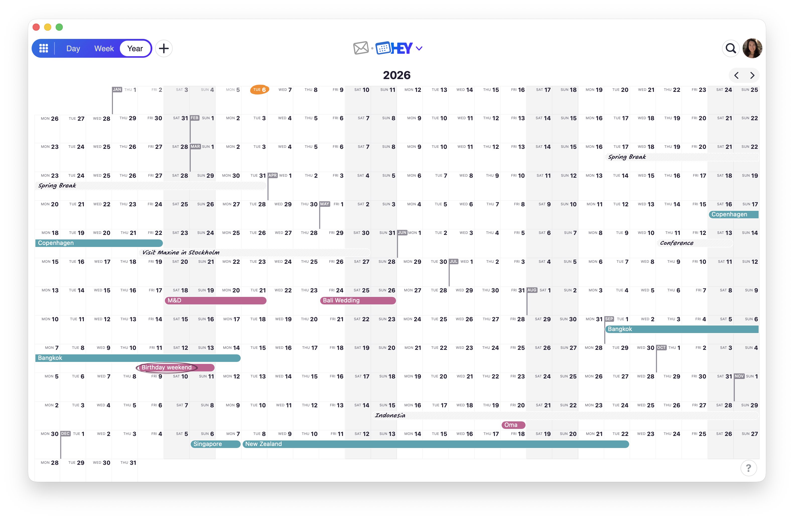
I’ve included comparison screenshots from Notion and Fantastical to illustrate these suggestions:
Notion’s implementation demonstrates cleaner property organization and visual hierarchy
Fantastical shows how subtle design choices can improve readability
The goal of these improvements is to transform the Calendar view from its current state into a truly useful tool where information is easily accessible and comprehensible at a glance.
Would love to hear if other community members have similar experiences or additional suggestions for improving information visibility.
Calendaring is so problematic on Fibery that I’m thinking of switching to SmartSuite solely for my calendaring needs. Not only is it more readable, but you can also create a calendar feed out of any calendar view, allowing you to feed all the data to any calendar app of your choice.
Having a feed alone would solve the readability problems because you could just use whatever calendar app you like.
EDIT: I just checked out Timeline view and this may remediate the issue. But… exporting dates to my firm’s calendar is 100% the way I hope this goes. It’s a pain to come in to Fibery constantly to check dates.
Wanted to check in on this - is there now a way to export a single view to a single calendar? Or perhaps generate a CalDAV link from a view to import in to a calendar. This would be so helpful, and something SmartSuite has had for maybe 2 years now.
Very needed! Zooming out as much as possible in the calendars but also being able to zoom in to see the hourly breakdown of each day with the time blocks is something that I would also love to see! Also improving the entity display in the monthly view. Hopefully soon!