Entity view seems to be unnecessarily limited for max-width, and it prevents seeing all columns of wide collections table views:


Entity view seems to be unnecessarily limited for max-width, and it prevents seeing all columns of wide collections table views:
This is by far my biggest UI pet peeve. A full-width option could be the single biggest quality of life improvement for me, because right now I have to full screen almost every collection block.
Similarly, I don’t understand why the center to-many/collection column is wider when there are fields on the right column and narrower (but centered) when everything on the right column is hidden.
Yeah, can we have this addressed please? I love that Fibery can have a lot of contextual data shown at once, but it’s often harder than it should be to display it effectively due to inconsistent max-widths.
Because of the recent feature where you can display expanded field information in the header, I wanted to try to use a single column layout, but the max-width gets even smaller if you completely hide the fields column!
Fields column expanded:
Fields column collapsed:
Fields column hidden (by turning off certain fields):
I also mentioned this via Intercom a while ago. Then it seemed that I was the only one wanting this so I’ve made a hack for it (I link an entity with description for the user why/how you need to collapse the field colum for full screen width ![]() )
)

But would be great if that’s not needed anymore since it clutters the workspace.
We will indeed address this as a part of Entity View improvements this spring. Thanks for the feedback and the screenshots!
We woud also love this. Currently our screens look like a Jenga tower ![]()
There are no plans to add support for extra-wide (full-width) setting for ‘simple’ fields.
Really? Respectfully, it seems like such a massive UI oversight. The option to expand fields to full width (which I love) is then at complete odds with the option to add “simple” fields to the left column (which I also love) and it really sucks to have to pick one or the other to ensure an entity doesn’t look visually broken. You introduced both options around the same time so I always assumed they were designed/planned to work in tandem and that such a glaring issue was going to be resolved in a not-so-distant release.
To be clear, I’m not asking for simple fields to be able to literally expand to full width because I know that would require a complete redesign for some of them (like files), I’m just looking for the margins/alignment of all fields to be consistent. I’m ignorant to the complexity, but having the left margin of the widest field on an entity be inherited by all other fields that are visible seems like it would be the simplest solution.
So in the image you shared, you want the ‘simple’ fields to be aligned left, even if they don’t become full width?
Yes, exactly.
This is still an open issue… The same way that docs have a “Page Width” toggle, have the ability to do this in entity view would be very much desirable.
Having the alignment be different for different fields is really ugly. See notion’s implementation as an example.
I also see no reason why not allow for simple fields to be full width. If i have a simple text field which is really long, would be great to have it full width. Or a multi select with many options. The top of the page in Single Column Layout shows the fields as smaller, and I could move them down to have then full width, or leave them up there if its shorter.
Also note that Lookup Fields do not have the option to go full width.
I agree with this. Maybe do a 3 column (or a free grid/widget) options. I can have dozens of fields and so many space is wasted.
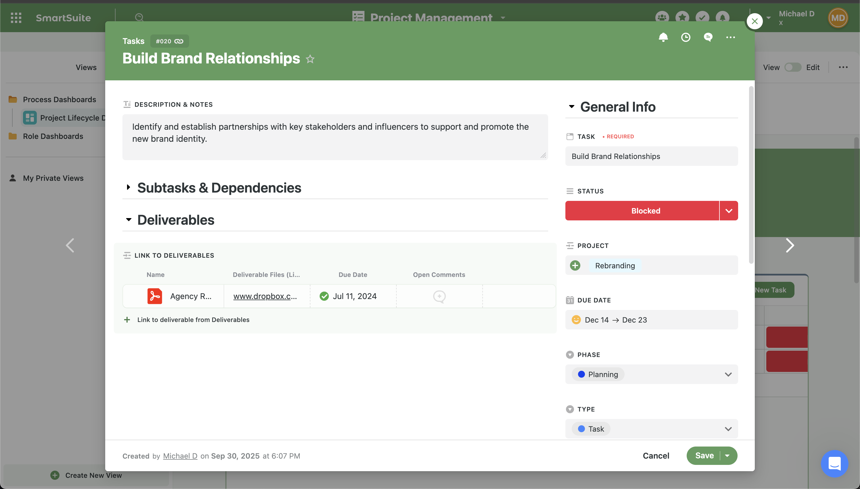
Also, something like a option to add a separator or collapsible section would be amazing. From all these “WorkOS” I recommend checking SmartSuite, they have probably the best entity detail.
Workaround is to use Stylish extension and fix the width yourself.
Unfortunately this option isn’t very scaleable across an organization with multiple users.
I’ve been using fibery for 3 hours for the first time today and I was already desperately looking for a full width option which led me here ![]()
Coming from notion i use timelines a lot for project management. But here they are so tiny here ![]()
@jandrabek where can I find this extension?
Otherwise fibery looks promising so far!
Hi @_4N, welcome here!
I believe that @jandrabek was referring to the browser extension to inject css into website. Stylish is Chrome the extension by https://userstyles.org/.
In case you need in other cases, there are also Javascript injection extensions, such as the open-source https://violentmonkey.github.io/. The problems are privacy and security (see below photo), and that they do not scale across multiple users as @interr0bangr correctly mentioned. But they definitely come in handy for specific use cases.