June 22, 2023 / View icons, prettier Formulas, batch markdown import

Hi @antoniokov!

Glad to hear that the tab title is on the radar! :slightly_smiling_face:

For the emoji, it seems like there was some refinement done, because now it does not look as jarring anymore:

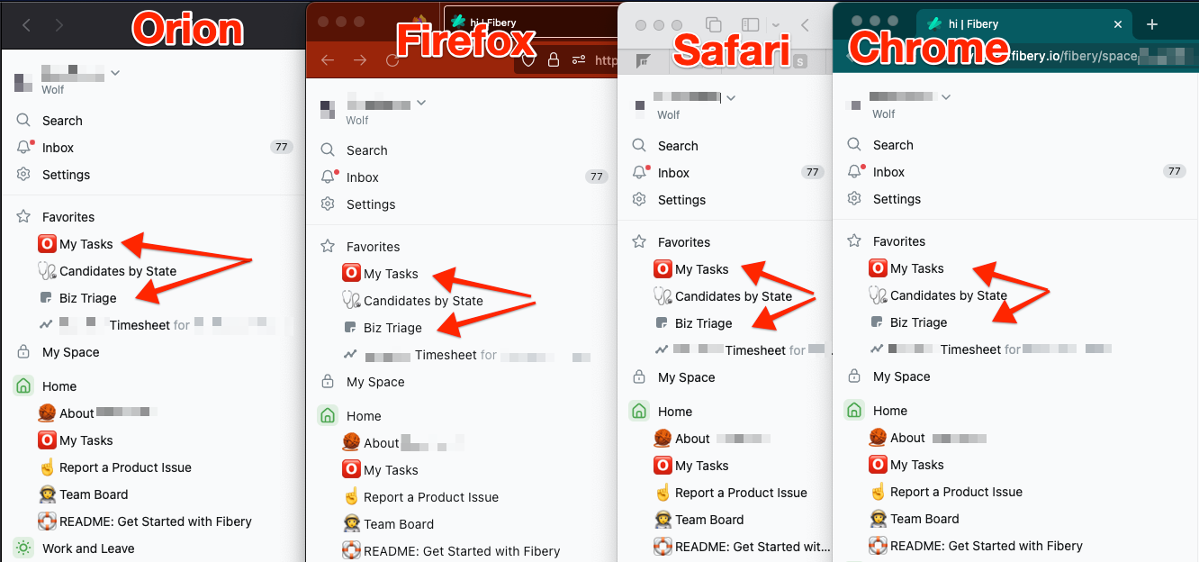
Though the space between a squared emoji like :o2: and an M seems still a tad narrow to me… not only, but especially when compared to the default icons, the emoji still use a slightly different spacing.

But the former I know is nitpicking, the default icons I hope will be refined together with this :wink::pray:

1 Like