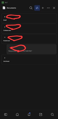
Entity names are always below the database icon, and “grouped by” field names are always below the expand/collapse arrow. This feels like a waste of space, especially for shorter names. And if the names went on the first line, perhaps there could be a little less padding between the icon and the left edge of the entity element (or the group header)
