In our team’s weekly work planning, I’d like to view a list of tasks that are grouped by client/project alongside some critical fields that are important for keeping things on track. This is a common use case that I’m sure most people would be familiar with.
This can be done in a few different ways, but they all have some really frustrating limitations that require extra clicks, scrolls or mouse overs to display everything in a simple and clear format.
I’m hoping minor UI/UX improvements could be implemented to solve these challenges.
Table View
This would be my preferred view to use, as it’s very easy for all users to understand and interact with, however because it’s just a single basic table with no cell merges/colspan or content wrapping options you’re constantly doing a balancing act between content visibility and column widths.
Current Implementation:


Ideal Solution:

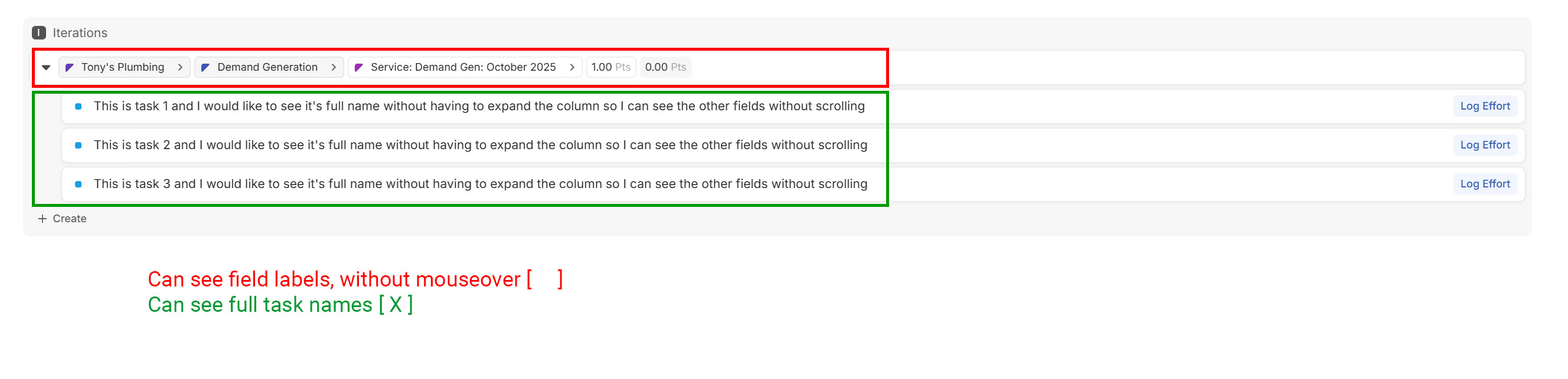
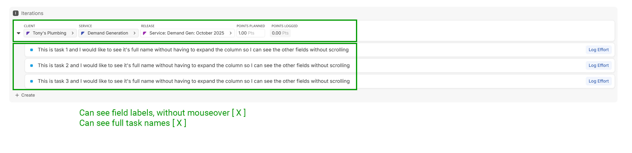
List View
Lists make it easy to see entity names, but really suck when it comes to displaying any relation fields, as there’s no options for field alignment or field labels.
Current Implementation:
Ideal Solution:
Board View
Maybe it’s unorthodox to use Board View without columns, but hey, if it can work, who cares? Board View already has the concept of “Card Size” which changes how field labels are displayed! Unfortunately, it only applies to the cards, and not the rows…
Current Implementation:

Ideal Solution:
