I wanted to request a change to the card view to allow “Parent” relations to display like the “children” do in the “Collections” area.
My reasons for this request:
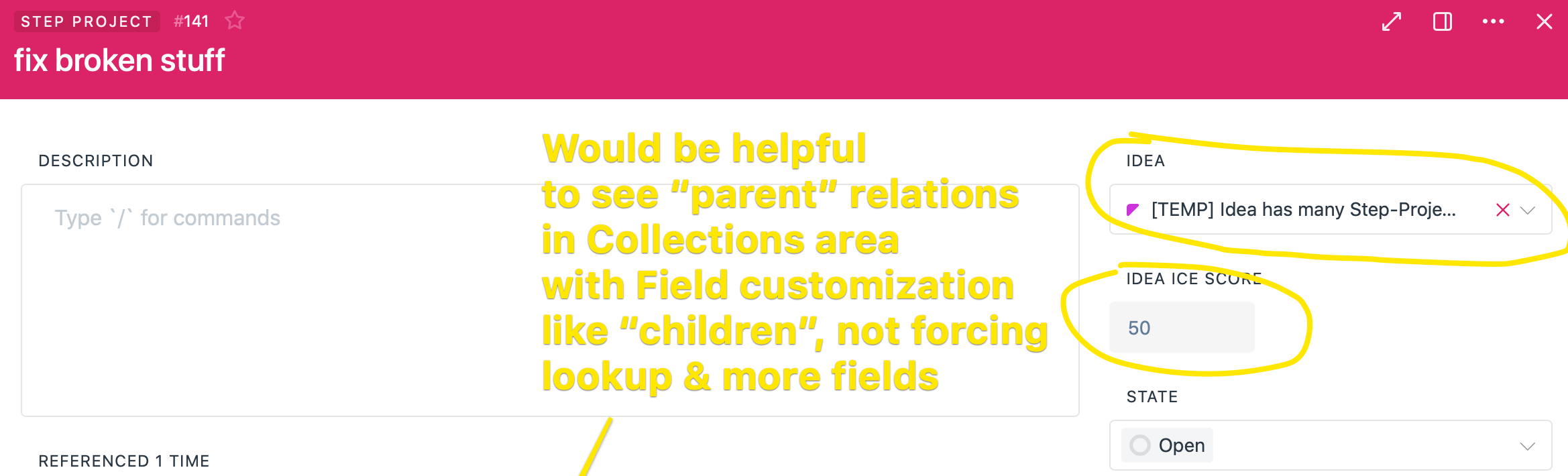
As I’m showing in the image now, if you want to see more info out of a “Parent” item, you have to add as many lookups as you need. So if you wanted to see the ICE score of an Idea, you need to add a lookup. If I wanted to further add that Idea’s status, then that’s another lookup. As I have been discussing with @Oshyan quite a bit, we are keep to limit “Field Proliferation” around Fibery. This is a situation where you are forced into adding them
It is also much easier at a glance to see the key info when its shown in one “line” as you guys currently do in Collections, which is a brilliant view and one of my favorite features of Fibery. But with the current set up, you have to rely on LookUps, which do not at-a-glance work as well to convey info about the Parent Relation. The Parent’s name can get “cut off” as in this example, and the UI effect is subpar in this set up
This is a relation, and I have found I am much better off looking at my relations in the “Collections” area, so I think this makes a lot of sense to have it there. The “right side” of the Entity View is very well thought-out, but perhaps it could be limited to fields that are not as significant as Relations and have only one string of data like “state,” “dropdown,” formulas which often generate a string, and other, simpler data types.
Thanks guys for the consideration and @mdubakov would love to get your thoughts!
Yes, I can definitely see the value in what you’re proposing.
Makes me wonder if it would be too complicated to allow more free-form arrangement of the entity views in general, and simply adapt (as-in “responsive design”) the display accordingly. So if I move a 1-to-many (Parent) relation into the left-hand area, it changes from simply displaying the name, to more of a “collections” view as @B_Sp put it. And similarly if I moved a “collection” view to the right side, it would simplify to only show the names. I could see value in having the ability to do both, and essentially establishing two view configurations for every field type. But I can also see that would be more work.
Basically I find myself wondering if it makes the most sense to try to always decide on behalf of the user where data/field types should go and how they should be viewed, allowing for more explicit design choices in the development of the app. Or to give us flexibility, which requires probably more complex development and also gives the user the power to create sub-optimal layouts (i.e. guides the user less toward the pre-determined “optimal most of the time” layout).
I think one other thing that is useful to consider are the new “lookup” Collection fields:
It would be enough to have the “Parent” entity be able to be shown like this Lookup. Since by definition, there is only one “Parent” in this type of relationship, so the “Collection” is really just a view of the one Entity with more detail. And again, we save potentially many Fields having to be created, about which there is a lot of discussion around here!
And fully agree that the more customization, the better, although here in Fibery there is a good deal of both this and “deciding on behalf of the user.” In the case of the basic card view, I think the Fibery Team’s good instinct for this stuff is really coming through. I just think this one additional ability to have those attributes of the parent visible would really help.
Just another thought on this: This ability would all-the-more be useful thanks to Fibery’s flexibility in arranging the Details View of Entities - to your point @Oshyan. I would set up something like this:
Where the parent item is at the very top of the card. So in the case of Tasks, I can see every time I open them the info on the “Project” they are in at a glance. This is extremely helpful. Right now, that Project is “over on the left” and doesn’t really differentiate much more than the “state” or some single-select I have on the Task.
I have thought about a workaround to do many-to-many relations to get this ability to create the Collection. But if I set up in this case my Tasks to “many-to-many” with my Projects, there will be various consequences downstream in Fibery with views, boards, and others given the differences on how “many-to-Many” and “one-to-many” are handled here. Which reminds me of what a great aspect of the architecture of Fibery that distinction is!
I would also like to suggest that possibly as an easier implementation, I would love to see some ability to configure the information on the Parent Entities like you can in Collections. Short of that, even the basic info that you get with inline entities and References, which I believe right now is this:
Type Icon
Entity Name
State
Assignee
One specific example I have is that I use a multi-level hierarchy that I have related, with the bottom level of this hierarchy the “Parent” the the Related Entity in the DropDown. So in the example in my initial post, imagine that “Idea” has a parent of “Idea Area” such as “Features” or “Tasks.” Since in this case, I have a bunch of Ideas, it would be great when selecting among the existing ones if I could see the level “above” of the category of Idea in this case, so is it an Idea for a Project, a Feature, a Task, etc. It would be enough to see that label, like I can see in many other areas in Fibery, to really help visibility with One-to-Many relations in this Detail View.
I hope that makes sense and thanks for the consideration!
One quick comment: the x-to-many relations (a.k.a. collections) are shown as a bunch of rows grouped with a common (colour-coded) background, so you can clearly see all the entities in the collection. Plus there is the “+ Link or create” text underneath.
Obviously, for x-to-one relations, these features are not that relevant (there will only ever be one entity, so ‘grouping’ is not needed, and you can’t link more than one, so the “+ Link or create” is not needed as an extra line).
I wouldn’t want all my x-to-one relations suddenly taking up a whole load more space if they were brought into line with the x-to-many representation.
Having said all that, being able to configure the visible fields of the linked entity would indeed be nice
Yes, I think this is all about keeping the Entity Details as clean as possible! My big issue to reiterate is this:
So to your point, there is no doubt value to keeping these x-to-many from taking up too much space. I think @Oshyan is getting at this too with the assertion that it might be good to have the ability to configure how you want to see either type of Relation:
What I’m trying to do is suggest with my latest post would be a solution to keep things more or less as they are right now, but in a way that you don’t have to use the LookUp fields to get info you need as well. Fibery already defaults the fields I mentioned…
… in References and Inline, so perhaps even those could be added. What’s more, you only see Assignee and State if they are actually on the Type, so that’s a cool dynamic display of fields that a lot of us have been asking about for the Entity Details View itself. And without any customization as is currently the case, if I wanted to see that info, I have to create three separate LookUps, what a waste of valuable fields!