August 10, 2023 / Semantic search, custom emoji, navigate to linked Entities

:sparkles: Semantic Search (experimental)

When you struggle to remember a name of a card, describe its essence to semantic search — and here you go. Instead of simply matching the words of a search query, semantic search uses modern OpenAI models to retrieve meaningful results.

Another scenario is when you don’t even realise what exactly you are looking for and whether the thing exists in the first place. For example, you’ve got a new piece of customer feedback and are looking for a feature or an insight to link it to. Simply select the quote and enable the semantic search when linking:

semantic-search-link-feedback

Check out our take on how to turn customer feedback into a prioritized backlog.

Unfortunately, semantic search is not plug’n’play. Here is a small checklist to enjoy the magic:

  1. make sure you’ve connected Open AI to Fibery
  2. add a few Databases to index in AI settings
  3. wait for a few minutes for the indexing

Check out a more detailed semantic search guide.

We are eager to hear your feedback on this thing!

:black_joker: Custom Emoji

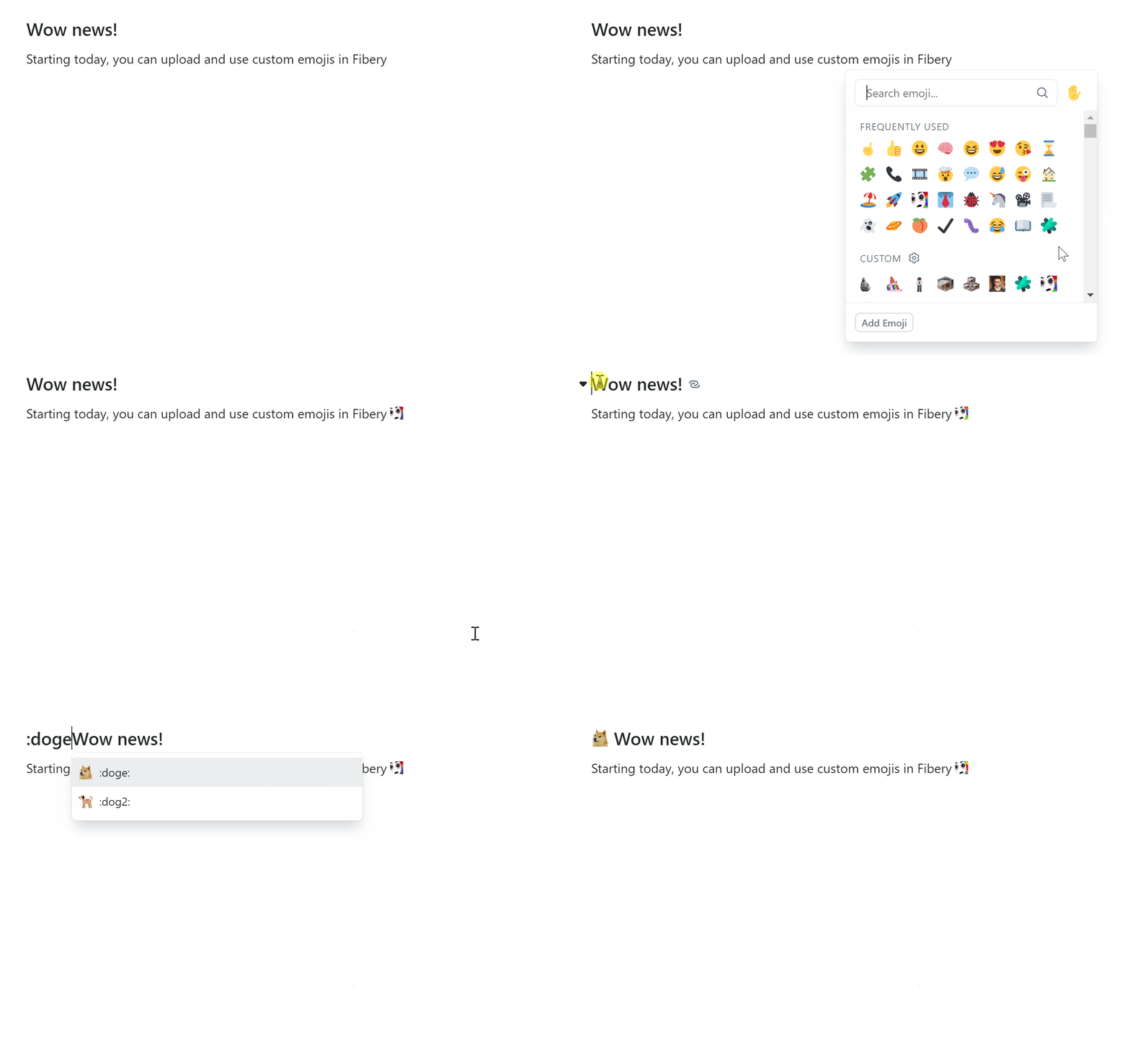
custom-emoji

Custom emojis are a big part of company culture, and ours as well. To quote Megan, a desperate ClickUp customer:

It’s such a seemingly small, but actually huge culture-builder in an all-virtual environment, complete with inside jokes, memories, etc.

From now on, you can upload custom emojis and use them throughout Fibery:

  • in rich text (documents, rich-text Fields, comments)
  • as callout block icon
  • as a View icon
  • as an Entity icon
  • as a select option icon

Check out custom emoji guide for more details.

:hole: Linked Entities navigation (experimental)

navigate-to-linked-entity

Previously, navigation between related Entities has been reserved for the selected few who have discovered the alt+click trick. Now it’s not a privilege anymore :sweat: .

The feature is still deeply experimental, so please let us know what you think.

:robot: Automation improvements

  1. Set Prompt parameters (model, temperature, tokens)
    When using AI in Automations, configure the prompt: for example, [ai temperature=0.5 maxTokens=300 model=gpt-4]. We support all OpenAI models such as gpt-4 and gpt-3.5-turbo.
  2. Send email CC and BCC
    When sending an email out of Fibery, specify who’s got to receive a copy.

:shrimp: Fixed Bugs

Grid View is getting closer to production:

  • Child entity isn’t assigned to parent if parent entity has been created in relation cell for item from ‘no parent’ group
  • Clear values by Backspace works wrong for check box fields
  • Selecting filter or sorting is not possible for relations in Grid
  • Checkbox value should not be updated on click in cell
  • Word and text selection does not work on clicks in grid cell

Production features are getting some polish as well:

  • Paste doesn’t work for checkbox fields (they are not editable, so ag-grid cannot paste to it)
  • ‘Was deleted’ in automation filter after rule was saved and opened for editing.
  • Paste undo applies one by one and it’s probably not good
  • Search is accent-sensitive in fields selector
  • @public mark disappears from url if open search on public workspace
  • Relation badge is shown instead of icon in docs and whiteboards collections
  • Emojis are cropped in Icon column on DB settings screen
  • Changes get lost in rules&buttons if user forgets to save them
14 Likes

Thanks for the amazing progress and new features!

About the pinned fields: its an improvement although I would use the little arrow for editing the field.

However, I see it still as a workaround for the importance of proper more easy and bigger navigation in that top area, which is a very valuable area. I think the pinned fields are still trying to do something that they are not made/designed for.

Proposed Solution:

  • Introduce a “Views Area” at the top of an entity that can accommodate any type of view.
  • Ideally, this area would feature a “Gallery View” for its ability to list entities horizontally.

Benefits:

  • Clear distinction between more emphasized (larger) navigation and (smaller) pinned fields.
  • Enhanced customization with various view options.
  • Simplified user experience without relying on tiny arrow buttons.
  • Consistent with other Fibery views.

Most suitable as navigtion: Gallery View: This would be a new view, a visually appealing block layout, ideal for horizontal entity listing. See also:

Are you suggesting a gallery view where entities from any other db could live?
How would the entities in this view be related to the entity? Would it contain every entity that is related to this one in some way?

Assuming that ‘gallery view’ existed as a view type, there will always be a tradeoff in UI when it comes to distinguishing between linking to/unlinking/adding new entities and navigating to the existing linked ones. How would gallery view solve this? I imagine that such a view would lend itself to navigation well, but not so much to adding/(un)linking, etc…
How would a select field (that a user is currently choosing to show as a pinned field) be represented in such a view?

By the way, are you aware that any existing relation view can be reconfigured in many different ways. Perhaps you want to mock up how you think it might work by modifying an existing relation field to make it a board view (which is currently closest to what a gallery view might look like) and including all linked items.

Overall, I’m just wondering what problem(s) with the current solution you are trying to solve - would it just be solved by making the pinned fields bigger (more like cards on board view) so that it is possible to see more information about them? :thinking:

1 Like

Thank-you for the update,

A small piece of feedback, it has been commented that the new emoji’s via /emoji are fuzzy.

I had a quick look, and - firstly I’m not quite sure how it works, because a:) it seems to be due to using GIF sprite-sheet which means on non-retina screen you get quite a lot of noise - essentially caused because the individual pixels get reduced to a size that is smaller than a single pixel, but b:) if I copy and paste the text out, I get the correct unicode UTF8 for an emoji :exploding_head: - which is cool, but magic ? Anyways … as this thing seems to be unicode, rather than use that sprite sheet, you could use a font that contained all your set of emojis. This would give ultra-sharp native competing emojis and support copy and paste operations.

Finally, great release - keep rocking ! :singer:

I’m pretty excited with this new feature !

However I’ve found in some cases it’s pretty unreliable :

Standard search :
image

And with semantic search I cannot find any bug with label “ikea”:

image

image

image

The database “Bug” is properly indexed (at the same time as the rest, a few hours earlier today)

This is small, but any chance these custom emojis will be available for the icon selection on Form views?
Great release as always!

Michel, under the hood reindex took more time than expected while we don’t have progress indicator yet. Now I can confirm that data from your workspace (col…web) is processed. Please, try again and let us know in case of issues.

I can confirm that today semantic search is working as expected. Thanks !

2 Likes

BTW, we REALLY want to hear the feedback about search quality, how often it finds things, what cases don’t work for you.

1 Like

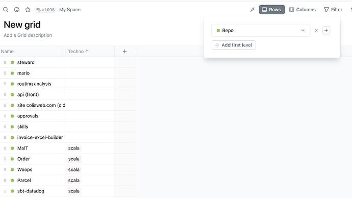
A feature I’m really missing in grid view is the aggregation of rows by “single select” field. (similar to adding an extra ‘first level’ above the main entity)

The only workaround is to create a new database with this “category” information instead, but for existing tables it is not always an option.

2 Likes

Hi,
You are on windows, right? Can you maybe share a screenshot of how it looks for you?

Unfortunately we can’t use emoji fonts as they aren’t supported in some browsers yet (Safari as always)(( E.g. when I open Noto Color Emoji - Google Fonts a lot of emojis fail to render

So for now we chose spritesheet-way and started using twemoji on every platform except MacOs a couple of releases ago (link) to make emoji-experience more predictable.

2 Likes

Same! Single select + state field (although state is a sort of single select, but still :smiley:)

We did this but the workarounds are pretty ugly :sweat_smile: so would be great if we can delete those.

Morning, rendering is like:
image

Sounds like the current implementation is as good as it can be then :+1:

Maybe in 2026 Safari will give us vectors :slight_smile: :rocket:

yeah, pretty ugly indeed… but I’m a bit surprised it scales so bad for you. Sprite uses 64x64 resolution so I would expect better rendering of ~18px image

well, I just realised that safari isn’t used widely outside macos so you are probably right and we can safely switch to the fonts instead. Should think about it a bit. Thanks for the feedback!

We will add it eventually. First we want to release Grid View and catch up with all Table View things, then we will add more cool features.

2 Likes

Stated on another post: Ability to search documents, rich texts, and comments. Currently, semantic search only returns entities within databases and makes it hard to gauge or feel the full potential. Also, there is no context with the results when searching using Semantics. It should show an excerpt from the entities that it matched, as opposed to just showing the name of the entities it has filtered. Similar to how standard search shows a preview of the searched text adds bold styling to the queried words.

Awesome release!

Regarding navigating to linked items.

What we really like

  • That we are able to open linked items easily :partying_face::partying_face: That improves the UX a lot.
  • That it’s easy to understand/explain what the difference is between selecting and opening a linked entity.

What is currently less ideal for our workspace set-up:

  • Some linked items are really useful to open. Think of linked contacts, tasks, notes, products etc. But we also have ‘helper databases’ which only purpose is to create hierarchy, structure, sort data, group data etc. In those situations it would be great to have flexibility to ‘turn-off’ the navigation > button. Since the user will find nothing when they open the linked entity (and it will save some space as well)
  • We have views where the name column is hidden and the first column is a linked entity. Example:
    • Overview of all orders, sorted by contact.
    • Name column = formula and hidden as column. Since in this view the relevant information for a user is part of a linked database (contact / bought products) or it’s a number (order value) or date (order date). So ‘name’ does not makes any sense.
    • In the first column we have linked the contact.
  • :arrow_up: In this situation it’s not clear for a user how to open the order. Since they (currently) only have the option to open the linked contact because name column of the order database is hidden.

I hope that the first official grid release has the option to create or open an entity if name column is hidden. But then I’m also curious if a user visually knows how to open the entity itself (order) when the first column contains a linked entity (in this case: a contact).

3 Likes

Yvette, thanks for the quality feedback!

Fair point. We have eventually decided against the > button on select options, and your DBs act pretty much like selects. Although we’ll have to wait for units configuration — it’s in plans, but without a clear roadmap.

Another great point! Let’s see what we can do here.

1 Like

This is impossible in fact, since Semantic search is different and it is not based on keywords, but on vectors and proximity in vector space. So nothing can be shown as a fragment…

2 Likes