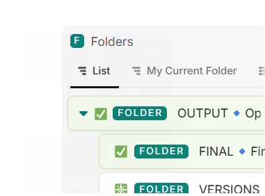
In a list view of nested entities, the entity icon gets replaced with the expander icon (the arrow toggle).
Information is lost: It results in confusion whether the icon actually does or does not communicate important information. It should be consistent in the same entity view items tree.
currently it becomes a mix of hidden and replaced icons.
Better is to separate their visibility, both have completely different functions.
I’d like to add my vote to this request.
It seems like a low-hanging fruit and would be a major QoL improvement for us.
This issue discourages the use of the icon feature as it makes their visibility inconsistent.
icons are a major part of how we can visually differentiate entities of the same database depending on specific conditions, which is something I feel Fibery has been moving towards with the multiple entity views and other recent features.
I’m checking in here again just to reiterate my interest in this fix/feature.
I’m currently redesigning our internal task tracking workflows and making extensive use of lists for their visual simplicity. Our users prefer lists by far over boards or tables.
Being able to rely on emojis regardless of the existence of sub-items would be a tremendous improvement in the reliability of the information shown in list view.
After fiddling with it some more I discovered that Icons can be added manually in the dispalyed fields, so it is possible to separate them from the database icon/expander arrow.
However in that case it doesn’t seem possible to prevent the icon from appearing twice per line object, which leads to visual noise.
Found a nice solution to this. Where it will always show the icon. But never (unless you have funky filters) show it twice.
You can create a formula field which will return the icon if there are children, and not return anything: “” if there no children. Then in the view settings you show that formula, and turn on “hide if empty”.