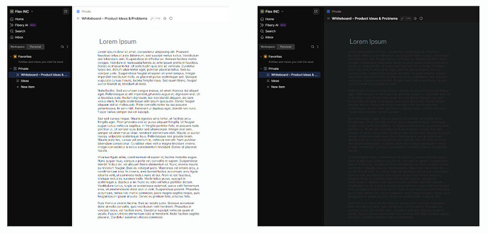
I really enjoy using the system in Dark Theme. However, when I work with the whiteboard, it becomes a bit problematic. Most of the presentations I create—whether for internal meetings or for sharing with clients—tend to use a white background, as it often looks more professional and visually clean. Because of this, I frequently find myself switching between Dark and Light Theme depending on the meeting or presentation context, which disrupts the workflow a bit. Additionally, when I prepare content with black text (which makes sense for white-background presentations), switching to Dark Theme often makes the text hard or even impossible to read—creating friction when reviewing or presenting the same material later.
Here are a few suggestions that could help improve the experience:
Allow per-whiteboard theme setting
Add a simple toggle or switch within each whiteboard’s settings, allowing users to define whether that specific whiteboard uses a light or dark background—independently from the global app theme.
Automatic or manual color inversion/adaptation
Implement an option to auto-adjust text and element contrast depending on the current theme (e.g., invert black text when in Dark Mode), or provide a “presentation view” that ensures legibility regardless of the global theme.
