# Left Margin on Database
**URL:** https://community.fibery.io/t/left-margin-on-database/11094
**Category:** Bugs & Issues
**Created:** [July 21, 2026, 1:01pm UTC](https://community.fibery.io/t/left-margin-on-database/11094 "2026-07-21T13:01:31Z")
**Posts on this page:** 7
**Page:** 1
### Author:  [@Eva\_Folch](https://community.fibery.io/u/Eva_Folch)
#### Post date: [July 21, 2026, 1:01pm UTC](https://community.fibery.io/t/left-margin-on-database/11094/1 "2026-07-21T13:01:31Z")
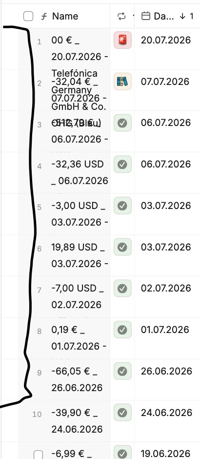
Am I the only one who feels there’s too much left margin in a database view? It feels wasteful on small screens.
Same issue inside an item, when a relation field is displayed — it gets even worse when the field name is hidden, since the margin ends up almost as wide as the field itself.

---
### Author:  [@Chr1sG](https://community.fibery.io/u/Chr1sG)
#### Post date: [July 21, 2026, 3:00pm UTC](https://community.fibery.io/t/left-margin-on-database/11094/2 "2026-07-21T15:00:22Z")
This feedback is appreciated, but to be clear, there is space reserved for the select tick box (appears on hover) and for the `>` if the Name field is not displayed.
---
### Author:  [@Eva\_Folch](https://community.fibery.io/u/Eva_Folch)
#### Post date: [July 21, 2026, 3:45pm UTC](https://community.fibery.io/t/left-margin-on-database/11094/3 "2026-07-21T15:45:23Z")
The tick box (“\>”) appears on the right, but on the left there’s nothing — that space just sits empty. The only way to get rid of it is if the Name field isn’t in the leftmost position, i.e., it’s moved further right in the database view.
> [@Eva\_Folch](#):
>
> 
Here the Name field is visible, and the tick appears on hover, on top of the text — but the left-side margin is too big.
> [@Eva\_Folch](#):
>
> 
Here, second image, the Name field is hidden entirely.

Here the Name field is placed further right, and the margin is gone. I think this looks much better — but you lose the tick box, since it ends up completely off-screen to the right, when there are many fields visible in the database. As a workaround, I use right-click to open the item instead.
Anyway, this is just my perception — maybe I’m the only one who keeps running into this. It was only a suggestion.
---
### Author:  [@Chr1sG](https://community.fibery.io/u/Chr1sG)
#### Post date: [July 21, 2026, 4:27pm UTC](https://community.fibery.io/t/left-margin-on-database/11094/4 "2026-07-21T16:27:08Z")
> [@Eva\_Folch](#):
>
> but on the left there’s nothing
What happens when you tick the select-all box (in the top row)?
---
### Author:  [@Chr1sG](https://community.fibery.io/u/Chr1sG)
#### Post date: [July 21, 2026, 4:27pm UTC](https://community.fibery.io/t/left-margin-on-database/11094/5 "2026-07-21T16:27:45Z")
> [@Eva\_Folch](#):
>
> The tick box (“\>”)
FYI tick box != `>`
---
### Author:  [@Eva\_Folch](https://community.fibery.io/u/Eva_Folch)
#### Post date: [July 21, 2026, 4:43pm UTC](https://community.fibery.io/t/left-margin-on-database/11094/6 "2026-07-21T16:43:40Z")
you mean this? :

There is still space on the left … actually, it would be nicer if the tick boxes are aligned with the “All select” Box on top…
Sorry if I don’t know the right naming of elements.
---
### Author:  [@Chr1sG](https://community.fibery.io/u/Chr1sG)
#### Post date: [July 21, 2026, 6:45pm UTC](https://community.fibery.io/t/left-margin-on-database/11094/7 "2026-07-21T18:45:38Z")
> [@Eva\_Folch](#):
>
> Sorry if I don’t know the right naming of elements.
No worries.
That feedback is appreciated and the relevant devs will be listening 🙂